 What The Swift
Date Picker in SwiftUI (iOS and macOS)
Date pickers are common components in many apps. From calendars, to-do lists, to apps where you need to input your birthday (we know you lied about it at least once), you need a way for the user to pick a date. Thanks to SwiftUI, this can be done in just a few lines of code.
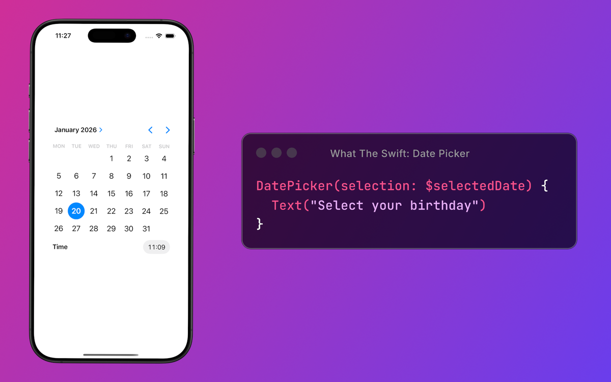
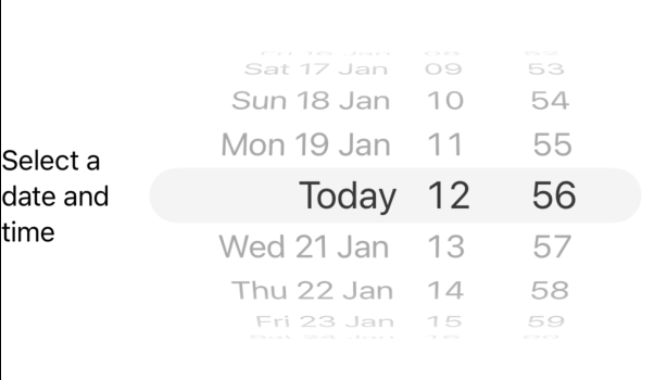
SwiftUI provides a default date picker that’s easy to use in your app.
@State private var selectedDate: Date = .now

var body: some View {
	DatePicker(selection: $selectedDate) {
		Text("Select a date and time")
	}
}
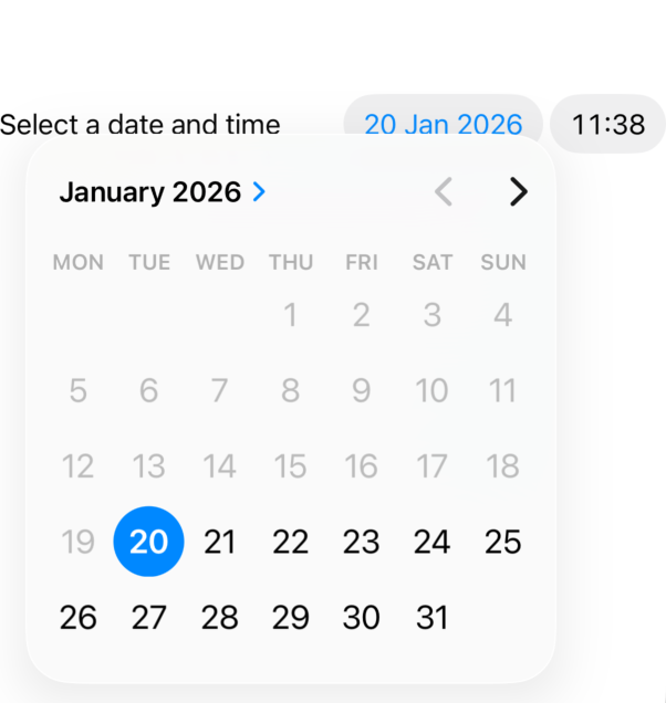
iOS: Date picker example
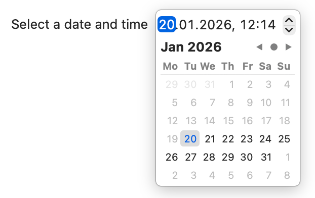
macOS: Date picker example
Bam! That’s it. You have a working date picker in less than 5 lines.
It also has some additional parts you can adjust.
In this tutorial you’ll learn how to use SwiftUI’s DatePicker with customization options for style, range, and subtitles.
Limit range
It’s important to set boundaries:
- in relationships
- when dividing Africa or US during colonialism (this is questionable tho)
- most importantly in DatePicker
Without boundaries people will misuse the picker (or hurt your feelings or steal the land you stole from others).
You can limit the range from which the user can pick the date. For example, if your app handles reservations for restaurants, you need to make sure that the user can pick only future dates.
The in parameter in the DatePicker’s constructor does just that.
DatePicker(
	selection: $selectedDate,
	in: Date.now...Date.distantFuture
) {
	Text("Select a date and time")
}
The dates outside of this range are disabled. You can set this to any custom date range you want.
Display style
To change the appearance, you can use the .datePickerStyle(...) modifier with one of the following parameters:
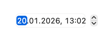
.automatic— the default style (as seen in previous pictures and videos).compact— date and time picker appear when you press the date or time cells, same as.automatic.graphical— date and time picker always shown.wheel(iOS) — displays components as columns in a scrollable wheel.stepperField(macOS) — components in an editable field, with a stepper beside them (same as.automatic).field(macOS) — components in an editable field

It would be nice to also have a style called “grandma calendar with AI generated cats and dogs”.
Components to show (or hide)
To choose which parts (date or time) to show, you can adjust the displayedComponents(...) parameter. It takes an array of components that you want displayed.
The possible items in the array are DatePickerComponents :
.date— displays day, month and year.hourAndMinute— displays hours and minutes (duh)
The previous examples show the case where both date and time are displayed. The following ones show how to display only one or the other.


If you also apply .datePickerStyle(...), it will affect the look of the component, even if only the date or the time is shown.
Subtitles
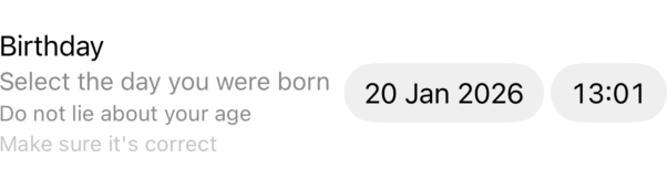
You can add multiple levels of subtitles by passing multiple fields to the label parameter.
DatePicker(selection: $selectedDate) {
	Text("Birthday")
	Text("Select the day you were born")
	Text("Do not lie about your age")
	Text("Make sure it's correct")
}

Hide label
You can also hide the label entirely by using .labelsHidden() on the DatePicker view.
DatePicker(selection: $selectedDate) {
	Text("Birthday")
}
.labelsHidden()

Limitations
There are some features that are not supported.
- selecting multiple days
- this can be achieved using the
MultiDatePickerview in SwiftUI
- this can be achieved using the
- enabling selection only of specific dates (eg. only on weekday, only on Fridays, …)
- decorations for dates
For the above two, you need to use a wrapper around the UICalendarView UIKit view.
This is what happens when Apple sets the boundaries: you don’t have access to everything in SwiftUI. 🤷♀️