 What The Swift
Color Picker in SwiftUI (iOS and macOS)
Color is a fun aspect of app development. By adding a little bit of color, your app gains life, looks better and improves the user’s experience.
Many times the colors are hardcoded and cannot be changed, but sometimes you want to let the user choose. For example in drawing apps the user can choose the color of the pen. In a note taking app they might be able to choose the color of a note or text.
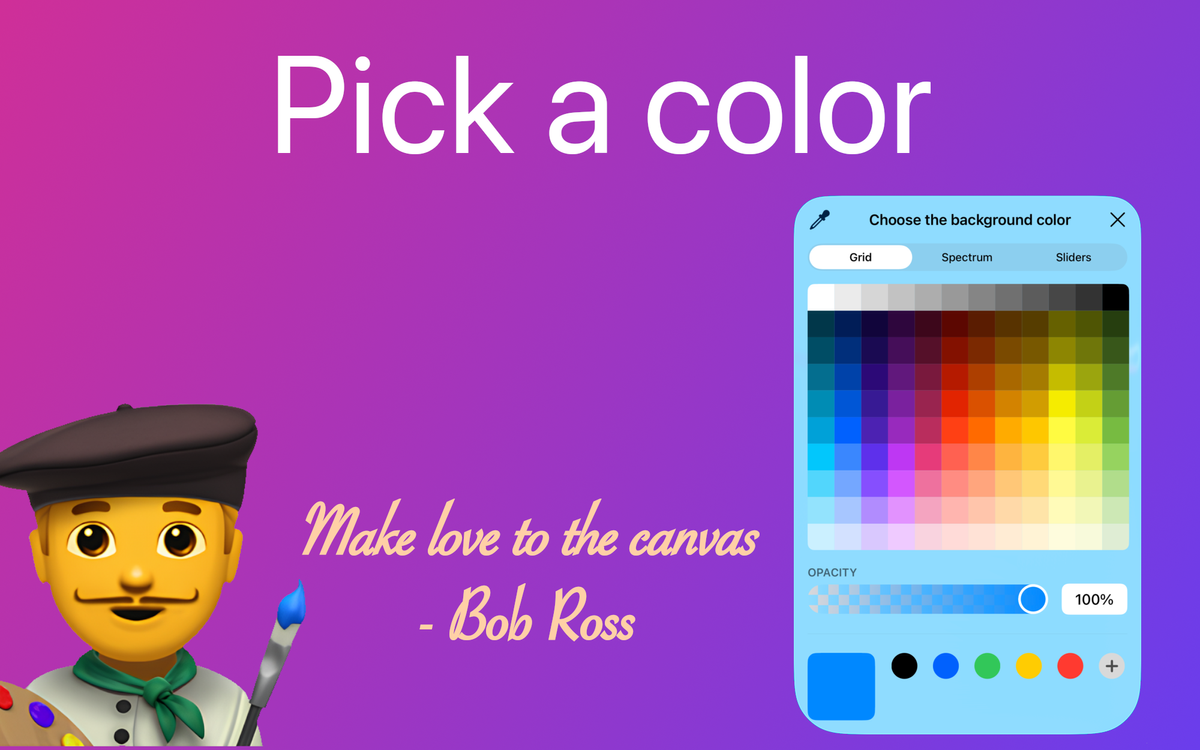
For these cases you can use the ColorPicker from SwiftUI. This view lets the user pick any color they want using a beautiful UI that’s readily available for developers to add to their app.
Color Picker
It’s very easy to add the color picker in your code.
The view takes only 2 parameters:
- title — text that will be displayed on the color picker button and the top of the color picker dialog
- color — a binding that will contain the selected color
struct ColorPickerExample: View {
	@State private var color: Color = .blue

	var body: some View {
		VStack {
			ColorPicker(
				"Choose the background color",
				selection: $color
			)
		}
		.padding()
		.frame(maxWidth: .infinity, maxHeight: .infinity)
		.background(color)
	}
}
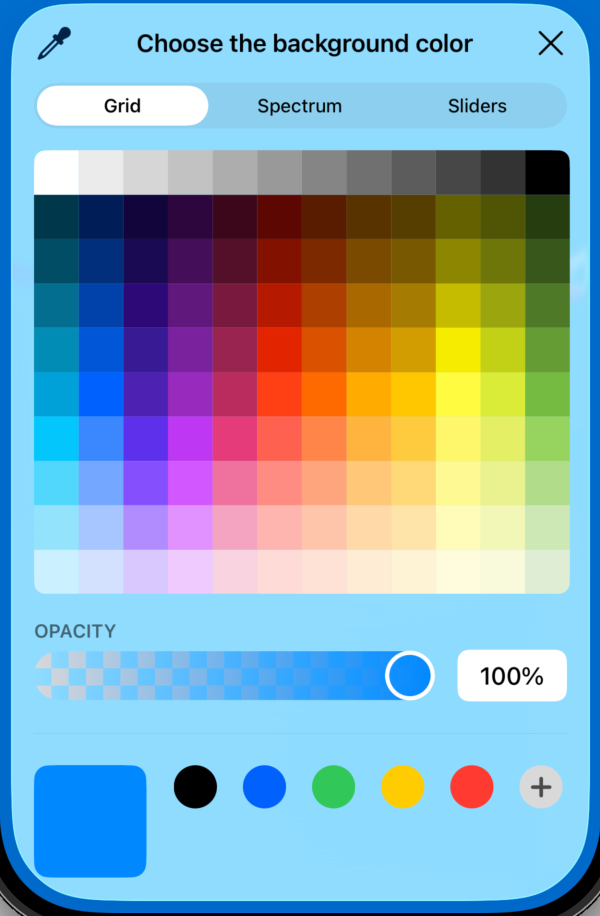
SwiftUI ColorPicker on iOS showing color selection and live background change.
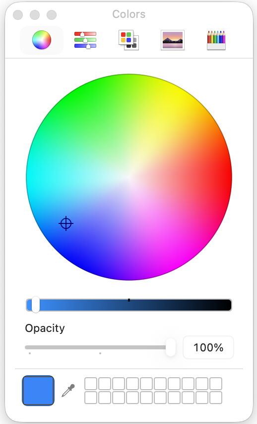
SwiftUI ColorPicker on macOS showing color selection and live background change.
Opacity support

By default the color picker supports opacity (how transparent a color is). If you don’t want this, you can disable it by setting the supportsOpacity parameter to false.
ColorPicker(
	"Choose the background color",
	selection: $color,
	supportsOpacity: false
)
Disabling supportsOpacity removes the opacity control, ensuring users can only select fully opaque colors.
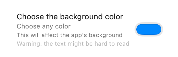
Hide label

You can also hide the title of the picker button and show only the icon. To do this, apply the .labelsHidden() modifier to the view.
ColorPicker(
	"Choose the background color",
	selection: $color
)
.labelsHidden()


Subtitles
Sometimes you want a more detailed description. To clarify the button’s role, you can add subtitles up to 3 levels, by adding multiple Text views inside the color picker’s label builder.
ColorPicker(selection: $color) {
	Text("Choose the background color")  // Title
	Text("Choose any color")  // Subtitle (Level 1)
	Text("This will affect the app's background")  // Subtitle (Level 2)
	Text("Warning: the text might be hard to read")  // Subtitle (Level 3)
}
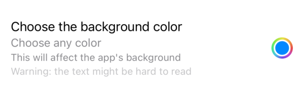
The first text will be the title. The following ones are subtitles, each one a level below the previous. There are 3 subtitle levels. Even if you add more, SwiftUI would handle the last ones as level 3 subtitles (the smallest size).
You don’t need to add 3 subtitles. Add only as many as you see fit. This example demonstrates all 3 subtitle levels and their appearance.
Show picker programatically (not covered here)
The SwiftUI ColorPicker offers a simple way to allow users to select colors in your app.
It has some limitations though. For example it doesn’t support showing the picker programatically or creating a fully custom button to present the picker. The only solution is to create a wrapper around UIColorPickerViewController from UIKit.
The drawback is that since it’s a wrapper you need to write more code and might not be as stable as using the native SwiftUI view.
How to see real colors
To see real colors, look at nature.
Touch grass. Go outside and see real colors in nature, not just your computer.

Thanks for reading, byeee!