 What The Swift
Button Styles in SwiftUI (iOS and macOS)
A good iOS app has buttons that stand out and feel intuitive. Applying a button style can make your UI more colorful, inviting and user-friendly. A well designed button grabs the user’s attention, while a simple button with no background, border, or color looks boring.
To apply a button style, use the .buttonStyle modifier on a Button in SwiftUI.
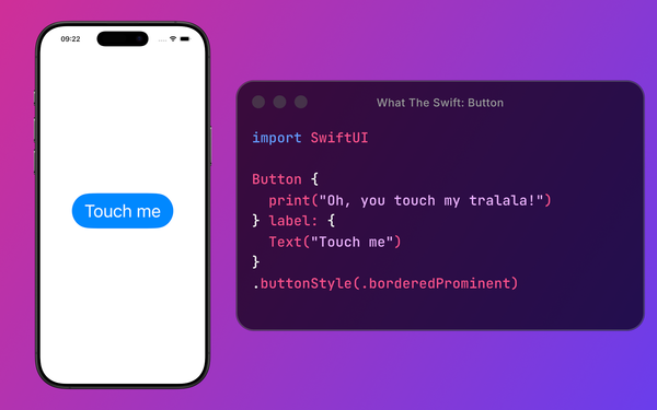
Button("Press me!", action: {})
	.buttonStyle(.bordered)
You can even create custom button styles, which we’ll discuss later. Let’s start by listing the built-in button styles in SwiftUI on iOS and macOS.
Recommended music to listen to while reading the article: Style (it's about SwiftUI, I promise).
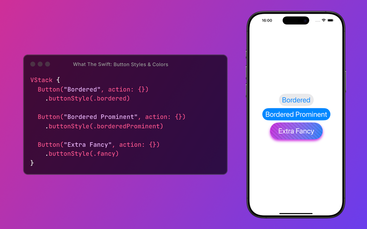
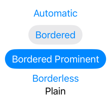
All Button Styles
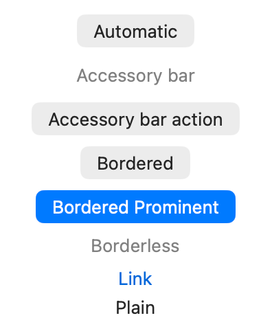
Here’s a list of SwiftUI button styles and how they look on iOS and macOS. (PrimitiveButtonStyle - Apple Developer Documentation)
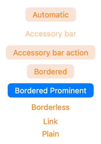
iOS
Button("Automatic", action: {})
  .buttonStyle(.automatic)

Button("Bordered", action: {})
  .buttonStyle(.bordered)

Button("Bordered Prominent", action: {})
  .buttonStyle(.borderedProminent)

Button("Borderless", action: {})
  .buttonStyle(.borderless)

Button("Plain", action: {})
  .buttonStyle(.plain)
macOS
Button("Automatic", action: {})
	.buttonStyle(.automatic)

Button("Accessory bar", action: {})
	.buttonStyle(.accessoryBar)

Button("Accessory bar action", action: {})
	.buttonStyle(.accessoryBarAction)

Button("Bordered", action: {})
	.buttonStyle(.bordered)

Button("Bordered Prominent", action: {})
	.buttonStyle(.borderedProminent)

Button("Borderless", action: {})
	.buttonStyle(.borderless)

Button("Link", action: {})
	.buttonStyle(.link)

Button("Plain", action: {})
	.buttonStyle(.plain)
Button Color: .tint
To change the button color, use the .tint modifier. The .tint modifier behaves differently based on the button style. Sometimes it changes the text color (.borderless), sometimes the background color (.borderedProminent), and other times it doesn’t change anything (.plain).

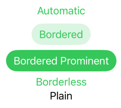
Applying .tint(.green) to every type of button:
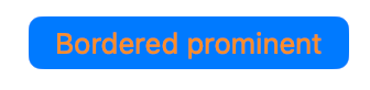
Text Color: .foregroundStyle
To change only the text color of a button, use the .foregroundStyle modifier.
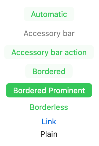
Applying .foregroundStyle(.orange) to every type of button:
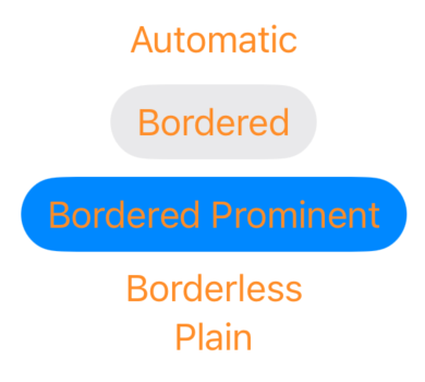
On macOS, applying .foregroundStyle to the button might not be enough to change the text color. The solution is to apply color directly to the label, not the button. (After .tint are we even surprised that it's not consistent?)
Button(action: {}, label: {
	Text("Bordered prominent")
		.foregroundStyle(.orange)
})
.buttonStyle(.borderedProminent)
Custom Button Style
You can also create custom button styles in SwiftUI that fit your design needs. Because you’re “not like the other girls”. You have your own button style.
struct FancyButtonStyle: PrimitiveButtonStyle {
	func makeBody(configuration: Configuration) -> some View {
		configuration.label
			.padding()
			.background(
			  .linearGradient(colors: [.blue, .purple], startPoint: .topLeading, endPoint: .bottomTrailing)
			)
			.font(.title)
			.foregroundStyle(.white)
			.clipShape(.capsule)
	}
}
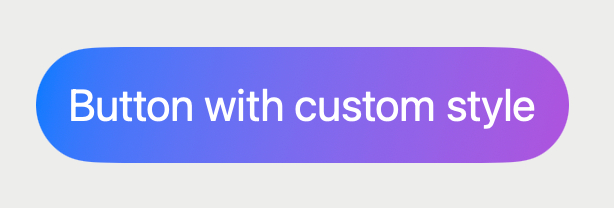
Button("Button with fancy style", action: {})
	.buttonStyle(FancyButtonStyle())
To make it easier to use, extend the PrimitiveButtonStyle class and add your custom style as a static variable.
extension PrimitiveButtonStyle where Self == FancyButtonStyle {
	static var fancy: FancyButtonStyle {
		FancyButtonStyle()
	}
}
This way you can apply your custom style like the default styles, using .fancy.
Button("Button with fancy style", action: {})
	.buttonStyle(.fancy)
Common Mistake: Style a Button’s Label
A common mistake is applying modifiers like .padding or .background directly to the button instead of its label.
Take this example:
Button(action: {
	print("Button tapped")
}, label: {
	Text("Try to tap me!")
})
.padding(120)
.background(.orange)
SwiftUI button example showing incorrect padding applied outside the label, reducing tappable area.
Even though we added padding to the button, it doesn’t react when pressing the orange area, only when pressing the text.
The solution is to always add styling to the label, instead of the whole button.
Button(action: {
	print("Button tapped")
}, label: {
	Text("Try to tap me!")
		.padding(120)
		.background(.orange)
})
SwiftUI button example showing correct padding applied to the label, making the full button area tappable.
This way you make sure that the entire area of the button is tappable.
Button Role and Style
Button roles such as .destructive and .cancel also affect appearance.
For example, a button with the .destructive role usually changes the text color to red on iOS, but not on macOS.
Button("Delete", role: .destructive, action: {})

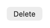
Even if you apply .tint of the button, the role takes precedence on iOS.
Button("Delete", role: .destructive, action: {})
	.tint(.green)  // has no effect because of the '.destructive' role
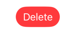
Button style also comes into play when using different roles. When the .destructive role is used for a button with .borderedProminent style, the background of the button also changes on iOS. As previously, on macOS the button is not affected and uses the default color.
Button("Delete", role: .destructive, action: {})
	.buttonStyle(.borderedProminent)
Not Only Buttons: .buttonStyle Works on Other Views Too
The .buttonStyle modifier isn’t limited to buttons. It can also be used on Toggle, Picker and Menu items.
In this article, we focus on the Button view since that’s where .buttonStyle is most often used.
Next episode: roles
You got a small taste of button roles, but the main course is yet to come. To learn why roles matter (not only in society, but also in SwiftUI) subscribe and tune in for the next article.