 What The Swift
Buttons in SwiftUI (iOS and macOS)
The Button is one of the most commonly used components in iOS and macOS. Let’s look at how you can use it in SwiftUI and what its main parts are.
The 3 main parts of a button are:
- action — what happens when you press it
- label — how it’s displayed
- role — describes the button’s purpose (optional)
Action!
The action is the most important part of a button, which defines what happens when you press it.
It's a simple callback with no return value or parameters.
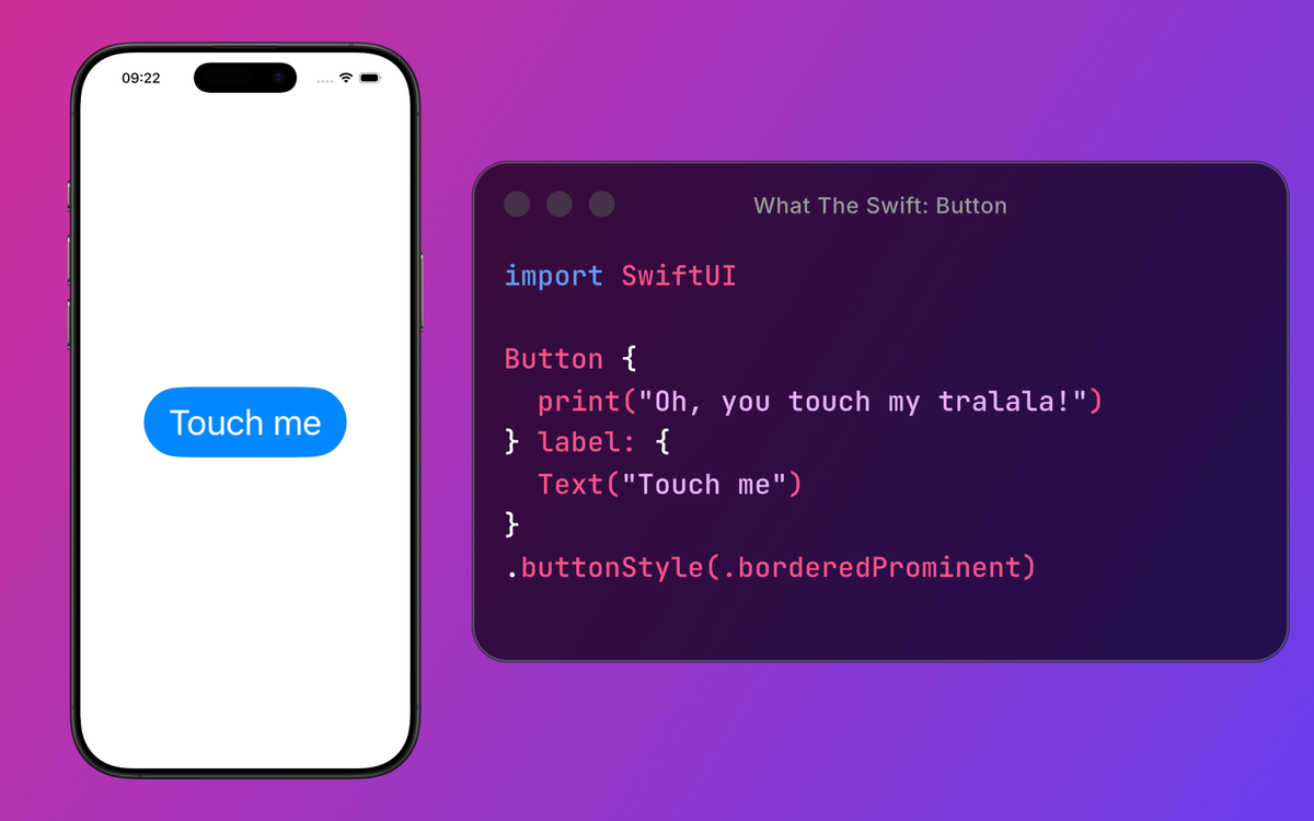
Button("Press me", action: {
	print("Congratulations! You won the lottery!")
})
Animated demo showing a SwiftUI Button triggering an action when pressed.
This action can be used to update the UI, submit a form, send a message, retrieve data from the internet, or open the door of your Tesla car. (Or lose your savings in the crypto market, but this is not financial advise).
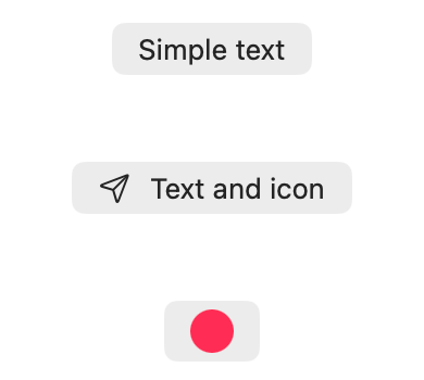
Label
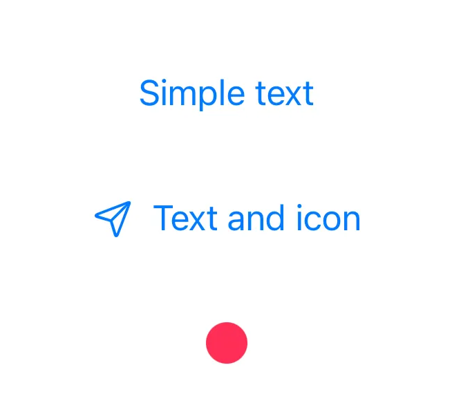
A button needs something to display and tell the user “hey, I’m a button and you can press me”.
This can be a text, an icon, a combination of the two or even a custom view.
VStack(spacing: 40) {
	Button("Simple text", action: {})

	Button(action: {}, label: {
		Label("Text and icon", systemImage: "paperplane")
	})

	Button(action: {}, label: {
		Circle()
			.fill(.pink)
			.frame(width: 20, height: 20)
	})
}
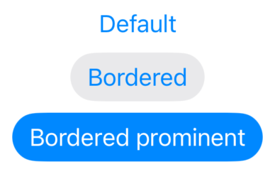
Style and color
A button with simple text looks pretty boring. Users are used to colorful buttons, which are usually used for important components in an app, like “Log In”, “Confirm payment” or other meaningful actions.
That's where the .buttonStyle() modifier comes in. As the name suggests it helps add style to a button. There are a few predefined styles, but you can also create custom ones.
VStack {
	Button("Default", action: {})

	Button("Bordered", action: {})
		.buttonStyle(.bordered)

	Button("Bordered prominent", action: {})
		.buttonStyle(.borderedProminent)
}
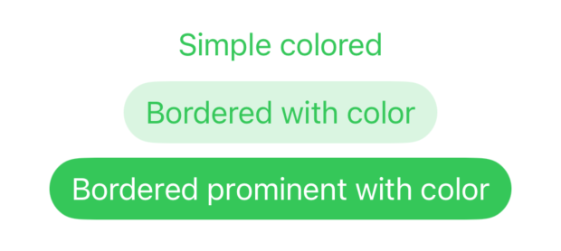
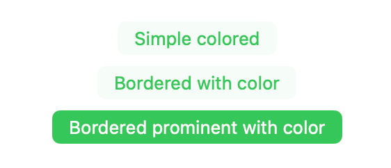
You can also change the color of a button using the .tint modifier.
For example, let’s make this button a Shrek button.

VStack {
	Button("Simple colored", action: {})
		.tint(.green)

	Button("Bordered with color", action: {})
		.buttonStyle(.bordered)
		.tint(.green)

	Button("Bordered prominent with color", action: {})
		.buttonStyle(.borderedProminent)
		.tint(.green)
}
Role
A button can also have a role, which affects its look and even positioning based on the context.
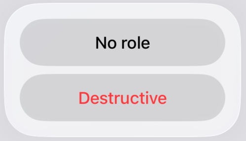
There are 2 roles in SwiftUI:
.cancel— use it when the button cancels an operation.destructive— use it when the button deletes/removes something (usually permanently)
Example: button role in an alert dialog
.alert("This is an alert!", isPresented: $isPresented, actions: {
	Button("No Role", action: {})
	Button("Cancel", role: .cancel, action: {})
	Button("Destructive", role: .destructive, action: {})
})
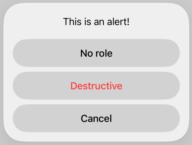
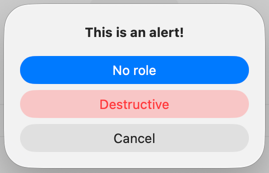
Notice that inside an “alert” and “confirmationDialog” the button with the .cancel role is positioned at the bottom. This happens even if we put that button in the middle, as seen in the examples above.
iOS 26 removes the buttons with .cancel role from a confirmation dialog, but on alerts they are still displayed.

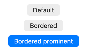
More about buttons
Subscribe to not miss the next posts: styling buttons and explaining button roles.
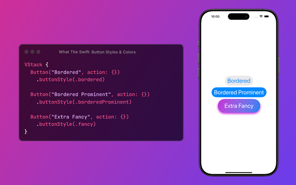
A sneak-peek of button styles.
Button("Subscribe")
  .foregroundStyle(.orange)
This should change the button's color to orange, right?
Does it change only the text color or also the background? Or maybe nothing changes?
To find out, check the next article about button styles.