 What The Swift
Button Roles in SwiftUI (iOS and macOS)
Buttons in SwiftUI can be assigned a “role”, which describe their purpose. These roles can affect how a button looks and even how it behaves.
In this tutorial you’ll also learn why macOS is very politically correct compared to iOS when it comes to button roles.
Buttons can have 2 roles:
.cancel— use it when the button cancels an operation (eg. cancel editing a picture without saving the modifications).destructive— use it when the button deletes/removes something, usually permanently (eg. delete a picture from your photos)
It’s not required to add a role to a button, in which case it behaves as usual.
Roles in different contexts
What effect a button’s role has on the button depends on the context. By context we mean “where the button is used”.
As a general rule:
.cancel— usually doesn’t affect the look of the button.destructive— affects the look (making the button red), and in some cases (list items) the behavior as well
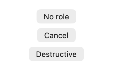
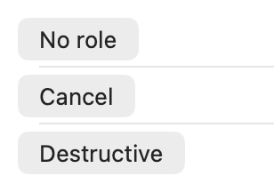
Simple container (eg. VStack)
When used inside a generic container, the button’s role changes only the style of the button.
On iOS, buttons with the .destructive role becomes red.
On macOS no visible changes happen for either role.
VStack {
	Button("No role", action: {})
	Button("Cancel", role: .cancel, action: {})
	Button("Destructive", role: .destructive, action: {})
}
When the destructive button uses the .borderedProminent style, the styling changes. On iOS the background changes to red, while on macOS it uses the default button color for the .borderedProminent style. Because macOS doesn’t discriminate based on roles (very nice or just lazy).
"We hold these truths to be self-evident, that all men/buttons are created equal."
— US Declaration of Independence (according to macOS)


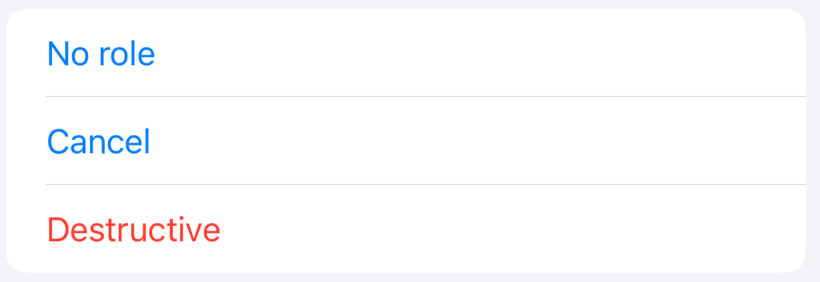
List item
Inside a list, a button’s role affects the look only on iOS, but not on macOS.
List {
	Button("No role", action: {})
	Button("Cancel", role: .cancel, action: {})
	Button("Destructive", role: .destructive, action: {})
}
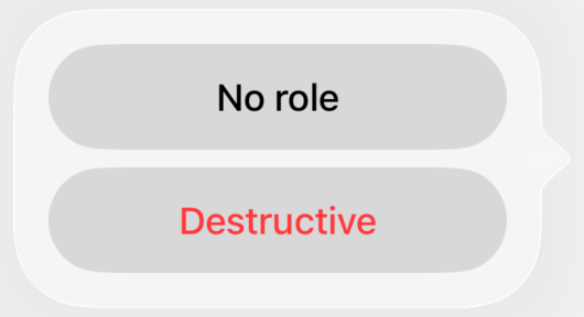
List item swipe (iOS only)
For the list item swipe action the .cancel role doesn’t have any effect on how the button looks or behaves.
The button with the .destructive however gets a red background, similar to earlier when using the .borderedProminent style.
List {
	Text("List item")
		.swipeActions {
			Button("No role", action: {})
			Button("Cancel", role: .cancel, action: {})
			Button("Destructive", role: .destructive, action: {})
		}
}
iOS: List item with button roles
The .destructive role also changes the button’s behavior. Even though no action is explicitly defined, pressing the button removes the item from the list, it “deletes” it.
iOS: List item delete
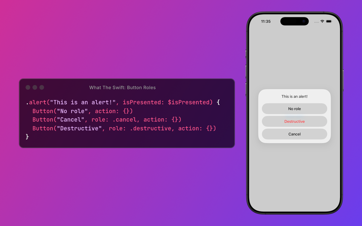
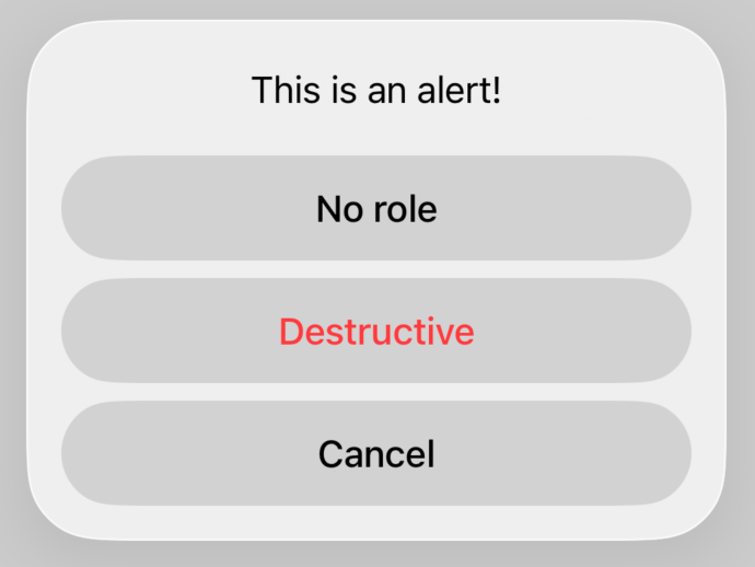
Alert
Inside an alert, the behavior isn’t affected, but the styling is.
The destructive button’s text changes to red on both platforms.
The cancel button’s text changes to bold on iOS, but not on macOS.
.alert("This is an alert!", isPresented: $isPresented) {
	Button("No role", action: {})
	Button("Cancel", role: .cancel, action: {})
	Button("Destructive", role: .destructive, action: {})
}
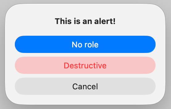
It seems macOS finally gave up and starts to make a differentiation between buttons with different roles.
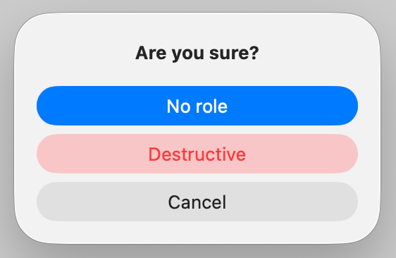
Confirmation dialog
In case of a confirmation dialog, the roles have a similar effect as inside an alert.
An additional change is that the cancel button is hidden since iOS 26.
.confirmationDialog("Confirmation dialog", isPresented: $isPresented, actions: {
	Button("No Role", action: {})
	Button("Cancel", role: .cancel, action: {})
	Button("Destructive", role: .destructive, action: {})
})
Notice that inside an “alert” and “confirmationDialog” iOS positions the button with the .cancel role at the bottom. This happens even if we put that button in the middle, as seen in the examples above.
SwiftUI does this to ensure consistent user experience across all alerts and dialogs on both platforms. Regardless of where the cancel button is placed in the code, SwiftUI will render it last, providing a predictable interaction pattern for users.
Understanding button roles helps create predictable, platform-native experiences.